Increasing engagement on Internshala through Gamification: UI & UX Case Study

Firstly, this redesign project is not related to Internshala. I have been designing digital products for a year now and this project was just to upskill myself as an aspiring Product Designer.
I got to know about Internshala through its training platform “Internshala Trainings” back when was in my 1st year. It helped me a lot in getting better at my skills, exploring new skill sets, and getting internships. Recently, the team also released the new app experience which was pretty amazing, you should check that out.
Why redesign?
As I said I have used both of their platforms (training and internships) a lot and during that time I started feeling the need for certain features, things that I thought could make the students experience even better.
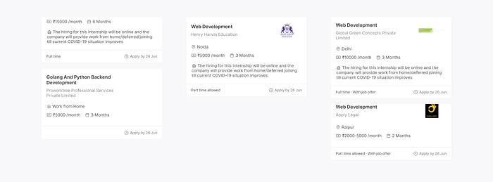
Examples, where the app could provide better experiences:


Goals
- Better visual hierarchy in the app
- Increasing the engagement with Gamification
- Reducing the friction by including the Trainings platform inside the app.
Research
Most of the research that I did was around how Internshala is acquiring new users and, what they’re optimizing for, and seeing reviews by existing users. Also, since I’m not from Internshala so I didn’t really have any user data as what’s the user behavior on the app, how often they use it, how they get to know about Internshala? So, to get close to this data I did some of the research which turned out to be pretty good and I gained a lot of insights from them.

- 56% (approx) users are using Internshala from their mobile devices.
- Page per visit is 6 (approx), which makes it more likely that a higher percentage of students are browsing for Trainings because very less likely that a student visits 5+ pages to browse for internships. We usually apply to them in the first 2–3 pages.

- “Internshala Trainings” is the fastest-growing keyword during Feb-Apr 20’ which I’m assuming mostly due to the COVID 19.

- YouTube and Whats App Web app are the 2nd and 3rd largest source from the overall social traffic.
- From their recent uploads on Youtube 25 out of 30 videos were based on “Internshala Training”. Internshala also has its Training referral program where students can refer to training to their known and earn some money. So, traffic that comes from Whats App Web is basically, students who are being referred for Training.

- From the keyword search analysis, it seems like visitors also prefer downloading the app (conversion rate on play store link is 13%).
User reviews:

Information Architecture
Internshala App has these top-level navigation information which students interact with:
- Internship Search
- Applications
- Chat
- Resume
Design is having a conversation with the users visually. Navigation is a conversation. Internshala has used hamburger navigation which makes it hard to switch between the different tabs. Also, for a new user, it’s hard to discover the features that Internshala is offering. Hamburger navigation is often used when you want users to spend 90% of their time on a single screen/major feature and some additional features could be hidden inside the menu. Whereas, Bottom navigation is used when you have 3–5 top navigation elements. Bottom navigation makes it easy for the user to engage with the application and lets them explore themselves.
Steve Hoober in his research on how do people hold their devices, (and interact with them) stated that 49% of the people rely on the thumb finger to get things done from their mobile devices.
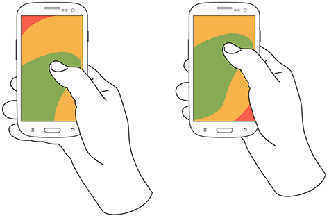
The Green area shows easy access to the interface, to reach within the yellow area, some effort is required by the user, and the red area means the user has to shift their hands or stretch the fingers out to reach the area. Try not to keep primary actions in red areas.
That’s why it’s important to use bottom navigation if you have more than 2–3 major tasks/ features for your users.
But don’t you think bottom navigation uses a lot of pixels/space on the screen?
So, I decided to use it only at top navigation elements and not in the secondary navigation. Also, features like hiding on scrolls could be used to make the experience even better.


Updated Navigation:


Home
The prototype at the bottom represents the new Home experience, through which students can search for Internships, access their saved Internships. All the new notifications related to internships will be shown here for ex. let’s say I followed Internshala, so when Internshala posts a new Internship I will get a notification here saying “Hey Kushal, Internshala has posted a new Internship, Check it out”.


How to decide if the Internship is related to the student?
For example if Internshala posts an Internship for a front-end developer, but I was looking for design Internship. It will decide by looking at the skills required for the Internship and if the skills required are similar to the skills I have in my profile, I will get the notification. So, its important to keep your profile updated :)

Action Sheets / Modality
I have used action sheets for a lot of actions that don’t require an altogether different page. Action sheets cover that underlying content and dim the content that hasn’t been covered by the sheet which helps in maintaining the context/task that the user was performing. These action sheets can be closed by swiping down anywhere on the screen.

Internship Search
New Search experience provides students with a very smooth search flow.
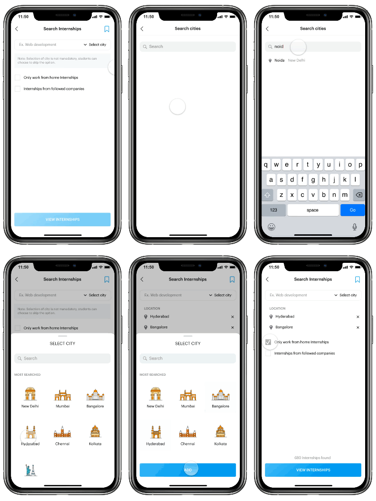
- Add Profile or search for a company
- Select City or Search will be irrespective of location
- You could also search Companies in the search bar which will show the location they’re hiring in and the if the Internships are available or not
- Students could also select, “Only Work From Internships” and “Internships from followed companies”. While searching, only these options could also be selected.
- For ex.
1. Student landed on the Internship search page
2. Selected “Internships from followed companies” only and no other option
3. “Search Internships” — Now only Internships from companies followed by the user will be shown.

Internships Page

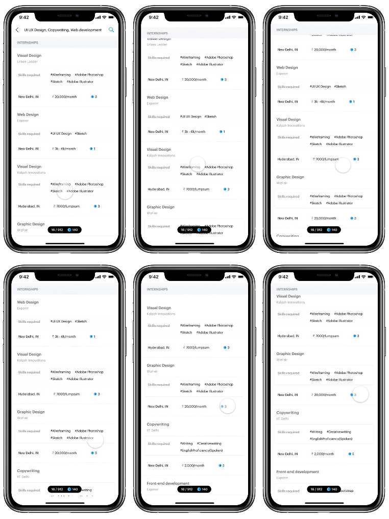
Remember I told Gamification? Here it comes…
So, I introduced a new concept of “Checks”.
What are Checks?
Every student needs some amount of Checks to apply for Internships. Checks can be earned by upskilling yourself. Adding skills, experience, projects, training, etc. These activities will add checks to your account, which you can later use while applying for Internships. Internshala also gives students an option before their Internship campaign launch, which requires students to invite their friends and in-return get early access to Internships. Concept of “Checks” could also be used here — “Invite friends and earn 101 Checks”.
As you see every Internship requires a different amount of “Checks”, so, how does this gets decided?
Very simple process!
To apply for an Internship 1–5 Checks are required.
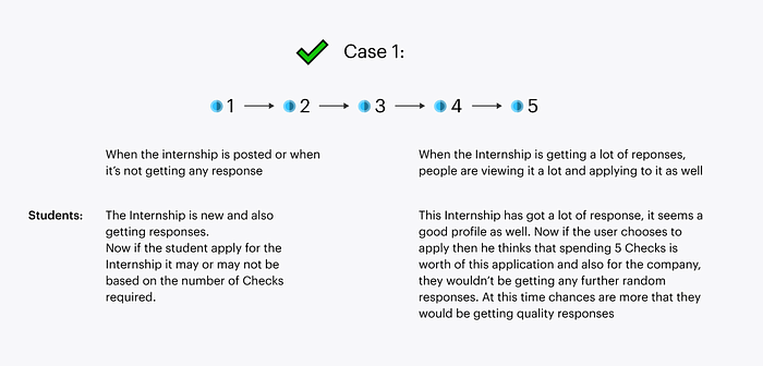
Whenever an Internship is posted by the company it starts with Check-1. As students start to apply, save, share, when more students engage with the Internship the Checks increases to 2, 3, 4, and 5.
It could have been 5–1 as well. But first let’s see students behavior in both the cases:

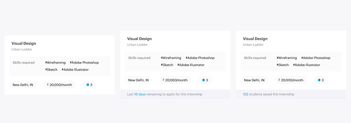
Internship Component
There has been a lot of time when I have looked into an Internship and the skills required were very different than what I thought. Sometimes in Design internships, they also look for a beginner front-end developer, which requires knowledge of HTML & CSS. So, I have kept it as a primary Information that students need to know before knowing more about the Internship. You might be thinking where is the last date to apply for the Internship? This is just a design decision that “Last date to apply” for Internships will be displayed only when less than 10 days are remaining. Also, I have limited the number of Internships shown on a screen at a time to 3–4 because a lot of information can be overwhelming for the user and might lead to an increase in the drop off rate. While using digital products users look for certain information out of the total presented to them and act within a certain period of time. Limiting the number of options (Internship cards shown) at a screen lets the users take actions fast. Now, only 3–4 Internship cards are shown at a time which makes it easy to consume and act fast.

The component above keeps students updated about the number of Internships that the student has seen till now and the total number of Internships found from their search. It also shows the number of remaining Checks that the student has.
How I separated primary and secondary information while looking at an Internship component?
What all it includes?
- Company Name
- Profile
- Stipend
- Place / Work from home
- Duration
- Last date to apply
- About company
- Number of openings
- Hiring manager
- Skills required
- Day to day work
While looking at Internships, the primary things that we focus on are the things that we have included in the search bar or the filters.
In this case, it is going to be:
- Profile
- Company
- Place / Work from home
- Duration
- Stipend

I haven’t completely removed the “Last date to apply” but I kept it for when the days remaining for the Internship to close are less than 10.
Two reasons for this first being that I haven’t even looked at what is the “last date to apply” while applying to Internships, because it’s the same as other elements and it’s everywhere, making it a general element. For example, While scrolling through the Instagram feed, the ads that we see has those “Learn more”, “Subscribe” call to actions which make us stop and see what’s being advertised”. Elements like “Sponsored” and “Links” differentiate advertisements from the posts. The last date to apply is actually important information for someone who is seeing the Internship in some final days of it being closed. But for someone who’s visiting the Internship very early, it doesn’t make any point to show that information. Showing it at the situation where it provides the user some value.
Showing critical information at times encourages users to make faster decisions without putting a force.
Making Internship Search Experience Better
How does search works?
Considering three major search elements Profile, Place/Location, and Company.
Combining searches:
- Profile + Place
- Profile + Company (works by default if you have followed the company page)
- Place + Company :( no, but why? because a company might be hiring, but not at the place that you’re looking in. Optimizing for providing more opportunities to students.
What was the problem before?
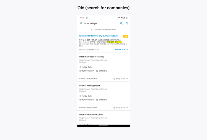
I could search by only one element and to add rest of them I have to go the filters after the search has been made, making the flow unnecessary bigger.
But then preferences?
Saving searches and then using them again is a better option cause whenever the user will use them again, they know what to expect from the search. While in case of preferences I might forget what I included in their months ago.
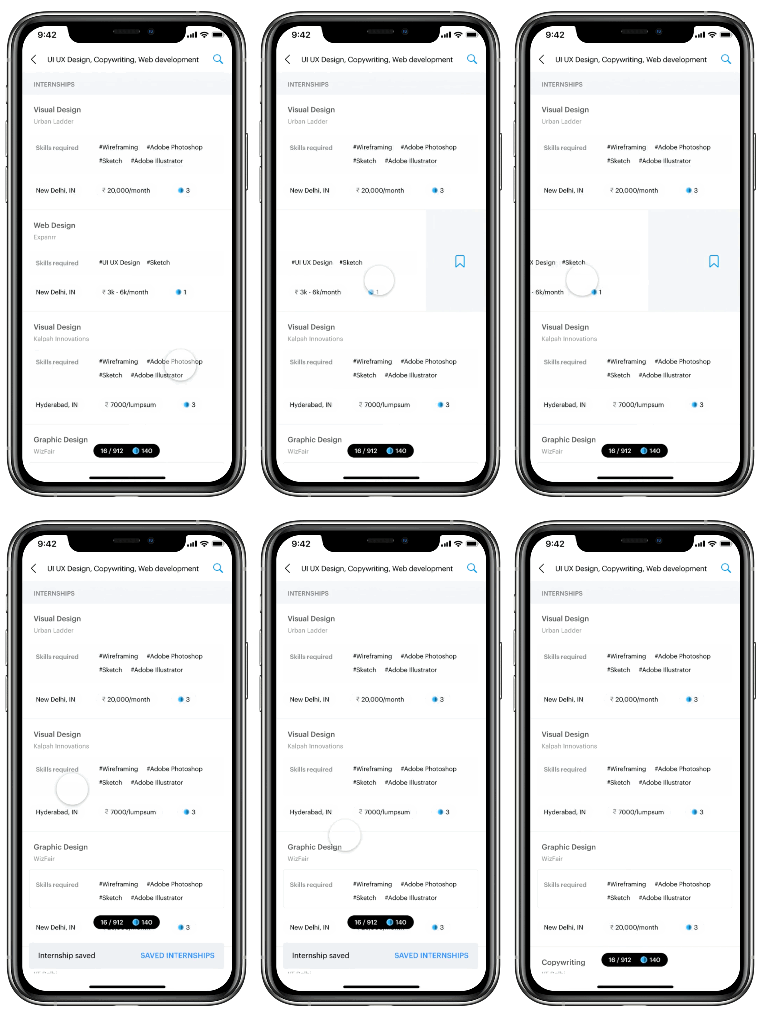
Saving an Internship

Filters

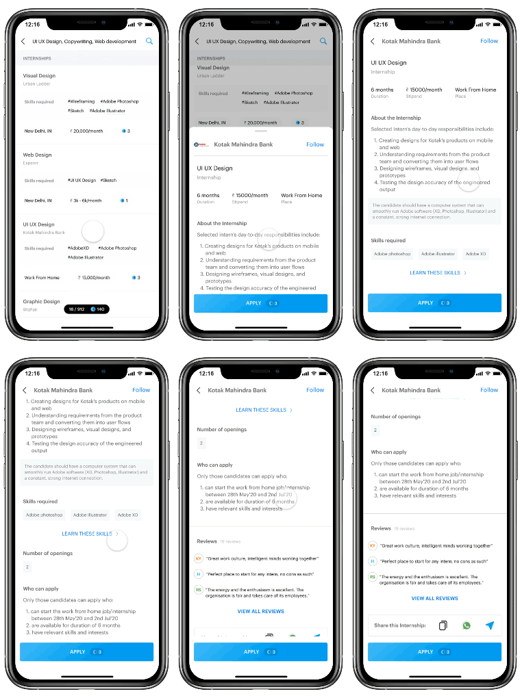
Viewing an Internship
Most of the information that is required to apply for an Internship is given on the bottom sheet but even if that isn’t sufficient students could scroll up and see all the information for the Internship.
Till now the student would have decided if they want to apply for the Internship or not and if yes they might be looking for more information. Not showing the full information at once creates the gap between where they want to be and where they’re (curiosity gap), which leads to a better quality of users moving ahead in the funnel.
Company Page
Companies pages help students in knowing about the company, locations they are hiring in, their hiring managers. Information about the hiring manager is useful because when a student is selected for the further procedures, conversations feel like we’re talking to an interface and not a person, adding a name is more than enough and makes the conversations more real. Reviews could also be seen by students, posted by students who interned there previously.

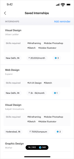
Saved Internships
It could be a situation that one might forget to apply for Internships that they saved last week. So, I added a very basic feature “Add reminder” where the app will remind students to apply for Internships.
What if I haven’t added the reminder and an internship is about to close/ the last date to apply is coming? The Internship will be displayed at the top saying “Internships closing soon”.
Applications
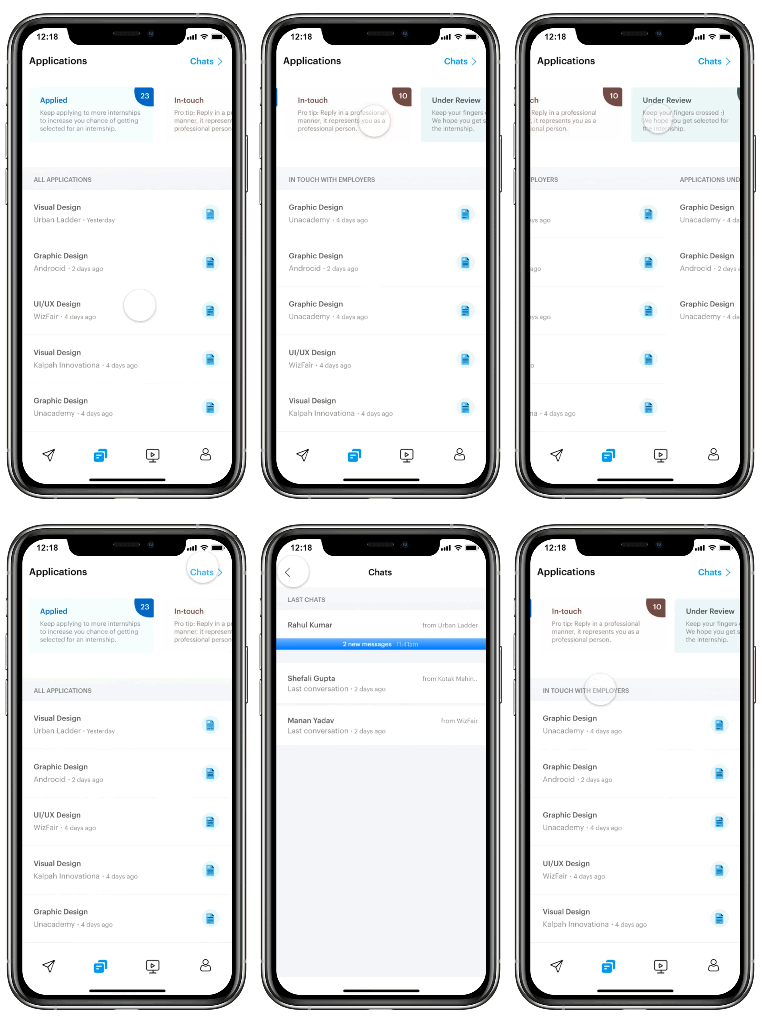
It’s hard to manage application after a number like 12–15. I just applied a basic rule “When something gets measured it gets managed”.
Now it’s very easy to look into the applications that a student have applied to, got selected for further process and once a student is selected
for an Internship, the “Selected” badge will be added which acts as a motivation.
I believe Applications and conversations with Hiring managers from companies are related to each other that’s why I have kept them on the same page.


Internshala Trainings
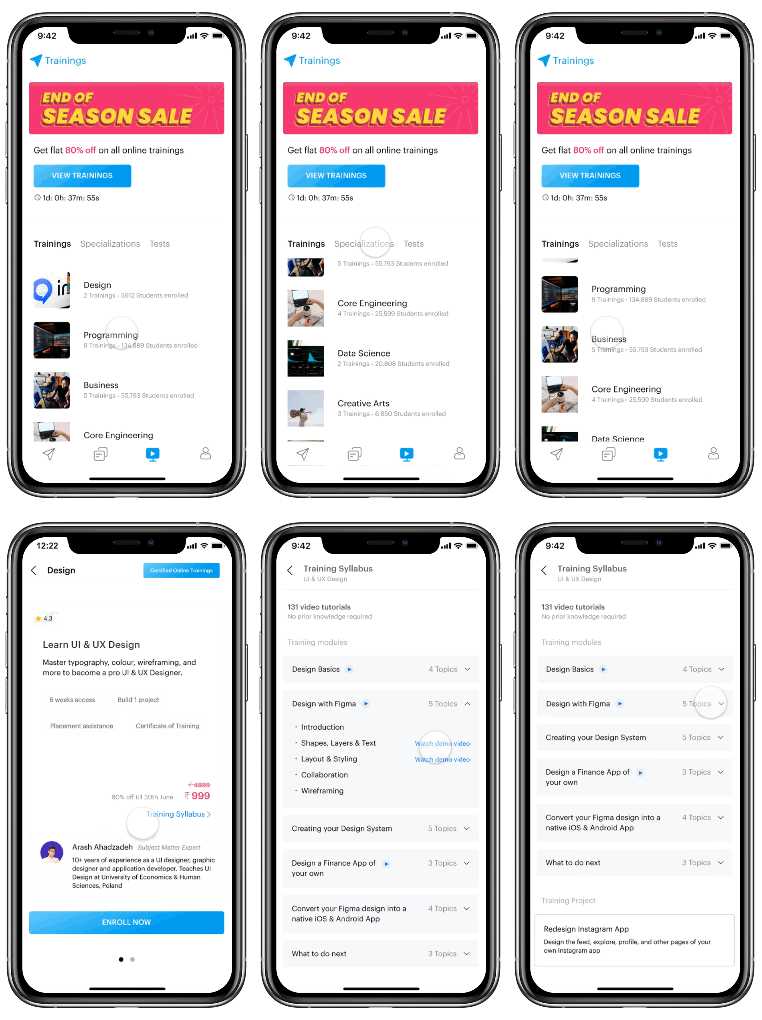
Previously, every time when a student used to click on the Training ads by Internshala it used to forward them to the browser, which increases the drop off rate, cause the user flow increases by one more step. Even if they are ready to purchase the training they will have to login inside the browser again.
Including Trainings inside the application is a better option to reduce that pain. Also, all the discount announcements could be made easily.
What are Tests?
Adding skills to your profile is like updating your portfolio, saying “yay I’ve started to learn this new skill, or I have completed an Intermediate course on this skill”. Previously there was no reward on that but now when you add you have to give a test which also updates your knowledge and earns you “Checks”, which you could use to apply for Internships. Passing a certain level of tests or by adding projects to your profile makes you a beginner or advanced in that skill because the hands-on experience is very important while learning something or while mastering something.
Profile
To make the profile more interactive and engaging I have included the skills, experience, projects, links inside the profile section. Now profile will act like a resume for students. For a long time, we have been managing our profiles on every platform and that’s why it has become an inherited behavior that can be easily used to manage a resume in the form of a profile.

Thank you for reading it out :)
Since this is my first ever Design Case Study, I would appreciate if you could send me some feedback on how should I improve my presentation and design skills.
Check out the promo video that I made as a part of this project —

